Thursday 27 March 2014

2nd Photo shoot - part 1

 
The "ohh" photo (as I like to call it). This photo was the first one I took in this position and I got this idea from one of the existing double page spreads of a "We love pop" magazine. The problem with this photo is my face is to far down and the legs are not positioned properly so the image looks slightly weird. Another problem with the image is my location, however the reason I did not focus on location to much was because I was planning on cutting all the images out anyway so didn't see the background to be too much of a problem. However I later found out that this was an issue as it took far to long to cut one image out.

This image is slightly better as my head is looking further up however the legs are still an issue and the camera is to far away from the models face. Although to be fair it is an improvement compared to the 1st photo taken.

Slightly better again...


Finally, here I seemed to have perfected the posture, however it is too similar to the "we love pop" image and so can not be used as the main image but may be used a small on the side of the central  image.


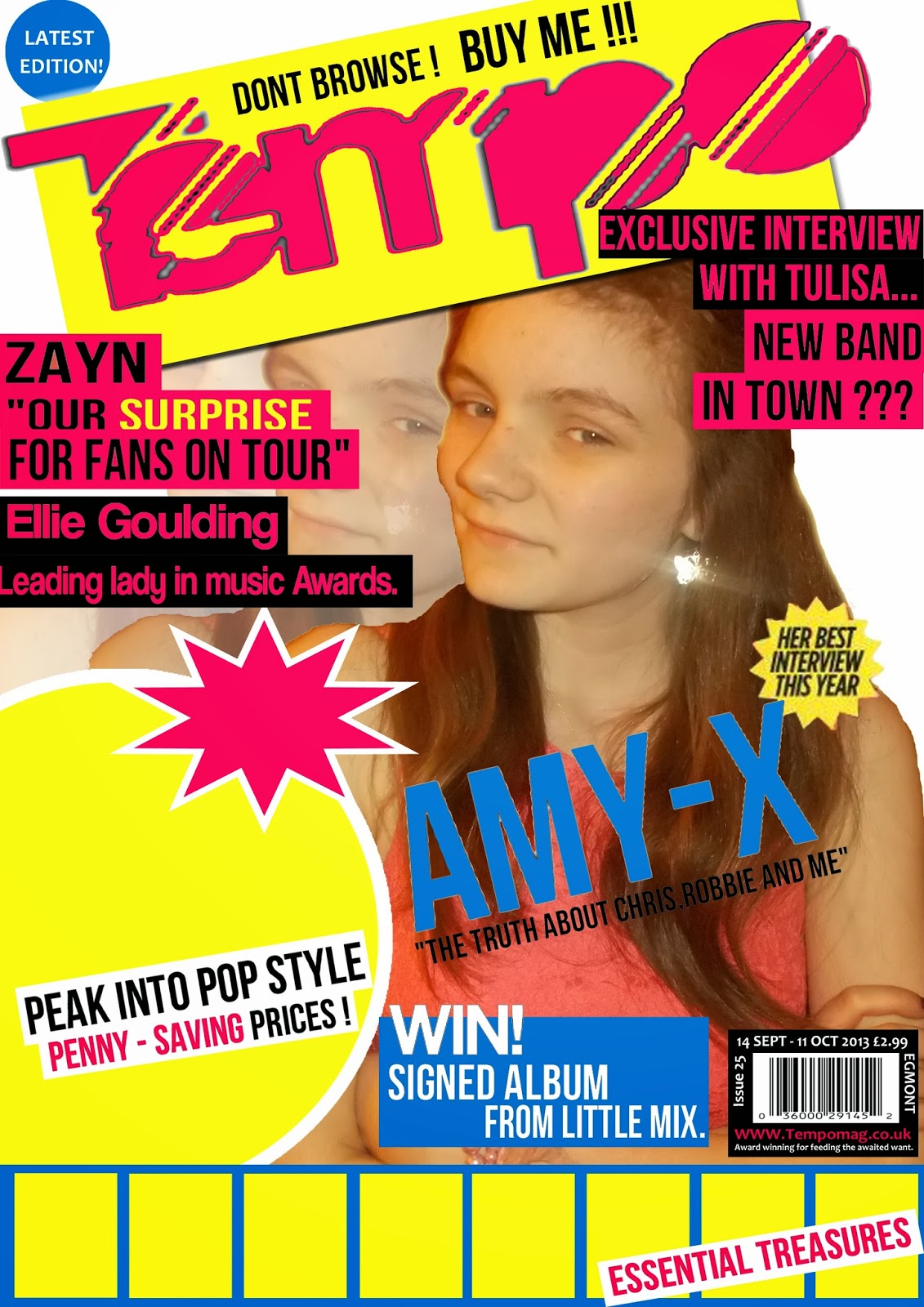
In the next five images I have decided to use a prop and the prop I have decided to use is a basketball. This is mainly because the double page spread will consist of an interview and the interview will be of "Amy-X" and as she is knew to the industry the reader will want to know as much about her as possible therefore I decided to make her hobbie basketball so she can connect with the younger audience. This will be reflected in one of the images to the side of the interview.
To a certain degree this image is good but I don't think it will work properly the way it should on the double page spread so I may not use it but I love the way the colour of the jeans and the ball clash to make them both stand out in the image. Shows the significance of both the artist and her interest. She is the centre of attention.
This image is good as its striking, again the contrast of the colours help it a lot, however if you look closely the image is blurred and so may not work where its needed. Its a shame because the model looks innocent and gains the interest of the audience, especially with the way the light is almost golden.

This image is by far the best image taken with the basketball as her facial expressions are interesting her posture is confident but questioning and she's holding the basketball as proud as she can so it stands out. This will be used on the double page spread as one of the little snip-its.

This image is also good as her stance is bold and confident.

In the next three photos I used a chair as a prop just to see if I could get a position that was unique and hadn't been used yet however, this was one of the worst ones as too much of the chair was in the shot.
This one was better but still too much chair in the shot.

This was the best chair one however the position was too male like and so I didn't think it would work well or it might have given off the wrong impression.

Double page spread/ adjustments to contents page

Today i stayed in school for periods 6 and 7 to begin my double page spread. This is what i have done so far and in my opinion i think its a good start. My double page spread will be split into two so on one side will be the images of the person interviewed, and on the other will be the interview. I will also make the left hand side worthy of cutting out so it can be used as a poster for the consumer.
There are still many adjustments to make such as the images, colour of the page (if any), and i need to add the content of the interview, but as they say "so far, so good". Im hoping to complete my front cover and contents page by monday so all i have left to do is the double pages spread.


Today i also came to the decision (with some help from Mr Sloan) that i needed to alter my contents page as it looked too much like the existing magazine "We love pop". So baring that in mind i have rotated the box's that will contain the images in them and put the page numbers at the head of the box's so that it resembles these are key stories that must be read.
I have also added yellow circles around the page numbers to help them stand out even more and added two arrows at either end of the title to show that it has a uniqueness about it.

My front cover - the adjustments

Today in my double period of media studies i have: changed the central image and now just need to add "poster images". I am confident this will be finished by monday latest.

Thursday 20 March 2014

Contents page - nearly finished

In todays double lesson all i have done is focus all my attention onto my contents page which has most definatly paid off.
Since the last time i added an update of my cover page i have added an editorial, the title to signify it is the contents page and the captions that will go beneath the images. The quotes from the "celebrity" is in blue so that it stands out to the audience and gives them a taste of the potential article.
I still have a bit left today and so tonight i will be doing my 3rd photo-shoot , once this is done the images will be updated to my blog and analysed as before.

Wednesday 19 March 2014

Magazine cover- latest progress

Here it is! My final pop magazine front cover i just need to add 6 more images at the bottom to act as "posters" for the consumer.
Today in lesson and my free period i added the two images at the bottom as "posters" to get started on them and i added a few images of clothing items that i made out were worn by the stars to attract a wider market.
I also completely changed the central image and i think this one works a lot better than the previous one, mainly because the model looks a lot more bold and is more confident than the last one. overall, i think i am on track.

Thursday 13 March 2014

The progression of my music magazine front cover.


Originally, this was my first draft of my magazine where i would have a range of photos at the bottom to act as posters for the reader. However, after talking with my media teacher we both agreed that the central image needed to be changed along with the shade of pink due to the fact its abit to grown up for the target audience it needed to be darker as to appeal to the younger audience. 


Baring this in mind i have currently changed the shade of pink and the shade of blue so the work together more affectivly. I still need to change the central image which i will be working on tonight, 13th thursday 2014, and i will post the latest addition to my blog as soon as i can. Overall, i am very pleased that i am nearly finished and it is looking more like a magazine every day :) 

Plan for my double page spread.


This is one idea for my double page spread, i decided i would like it to be quite packed but simply laid out at the same time. On the Right hand side i will have the interview of the artist, the questions will be in another colour so they stand out and beneath it will be the artists answer. Within the answers/ artists response will be a highlighted quote to show there may be some importance in what the artist said. Then on the Left hand side will be the main image of the artist looking bold and confident which will be made so that the reader can cut it out to use as a poster if they want to. There will also be little snaps of the same artist maybe even from the same photo shot to enhance their importance to the magazine. At the bottom of the image there will be a small caption of what the image was for and maybe where it was based, simply stating who it is and the basic information that a reader may need to know. At the beginning of the article i will also have an introduction of the artist and here i will add a "Drop capital" just so the reader has something to go on if they have not heard about them before. (Background history) The "Pull quote" will be based at the top of the Right hand page so that the reader is instantly dragged in to the story/interview, getting the hocked from the beginning. The name of the artist will also be at the top as well maybe in italics so that the article is clear on who it is about. 

My second idea is simular to the first but just swapped round so that the main image of the artist will be on the Right hand side instead, it will still be able to be cut out to use as a poster if required but this time there will only be one image. I believe they call this a portrait of the artist. Then on the Left hand side will be another image of the artist in a different position or location and the article will be right next to it. The "Pull quote" will be placed at the top in order to gain the readers attention at first glance. 


Overall, i think i prefer my first idea so i will begin to make it using photoshop and see how it turns out, this is mainly because this one seems to work the most effectivly whilst consisting of all the conventions of a double page spread. 

Wednesday 12 March 2014

Main features of a double page spread!

Double page spread ideas ...
Main conventions of a double page spread are:
  • Main image that outlines the whole page and signifies who and what the article is about
  • usually, for a pop magazine there is a "pull quote" from the article as the title
  • Normally, there will be more than one image 
  • The article will be about an interview of the artist and there fame or personal life
  • Certain bits from the article or the question will be highlighted so the audience take notice of this in particular
  • The article will be portioned off into to paragraphs of the question and the answer
  • The aim of the article is to be informative and provide the latest gossip for eager fans
  • The article will use "Drop capitols" at the beginning of the sentences or where it works