Monday, 12 May 2014
Evaluation- part 6
What have you learnt about technologies from the process of constructing this product?

Throughout this process of making a music magazine i have learnt and awful lot about photo-shop which will be notified in question 7. I have learnt how to edit photos and manipulate shapes in order to fit my genre for example;


Here i gathered 4 examples of my title through the use of "dafont" this shows that i gathered many examples and used photo-shop to edit them and add colour to make it more appealing.
Throughout this process of making a music magazine i have learnt and awful lot about photo-shop which will be notified in question 7. I have learnt how to edit photos and manipulate shapes in order to fit my genre for example;
This screen shot shows that images can be selected and deselected which will delete certain parts of the image that you request are not needed. when i first started this project i did not even know how to open photo-shop let alone to begin to edit photos and edit shapes to go into a particular layout.
This screenshot shows that paint can be injected to change the colour of an image or shape. This is what how i made the posters at the bottom of my front cover and also i used coloured shapes in the beginning of the project to show the layout of my pages and where specific things are supposed to go. This really helped me keep organised and aware of where all my conventions needed to go.
This screenshot shows a development of my double page spread and how there is a line in the middle of the page to show where the bend will be, along with the pink boxies to show were other images will go.
Evaluation - Part 5
How did you attract/address your audience?
In order to answer question 5 i decided to make a video of how my music magazine, Tempo, attracts its target audience and so i used someone around the age range that it is targeted for, to supply some audience fed-back. i did this in an interview type of style to encourage answers out of her and gather an understanding of how i meet my audiences needs.
13-17 year old demographic:
-www.Tempomag.co.uk
By making this website i am able to reach my targeted audience and give them brand new offers through the use of social media as this is a teenagers main use of interaction.
-Colour scheme:
The colour scheme to my magazine is the main aspect as pop magazines focus on how to invite the reader in, for my age range the use of colour is a fantastic technique as it will draw a wider audience in as it makes the magazine look fun,vibrant and interesting.
Friday, 9 May 2014
Wednesday, 7 May 2014
Thursday, 1 May 2014
Evaluation
This week i have started to create my evaluation on prezi. i have also made a rough plan of how to lay out my questions and answers, this will be posted as soon as possible.
Thursday, 3 April 2014
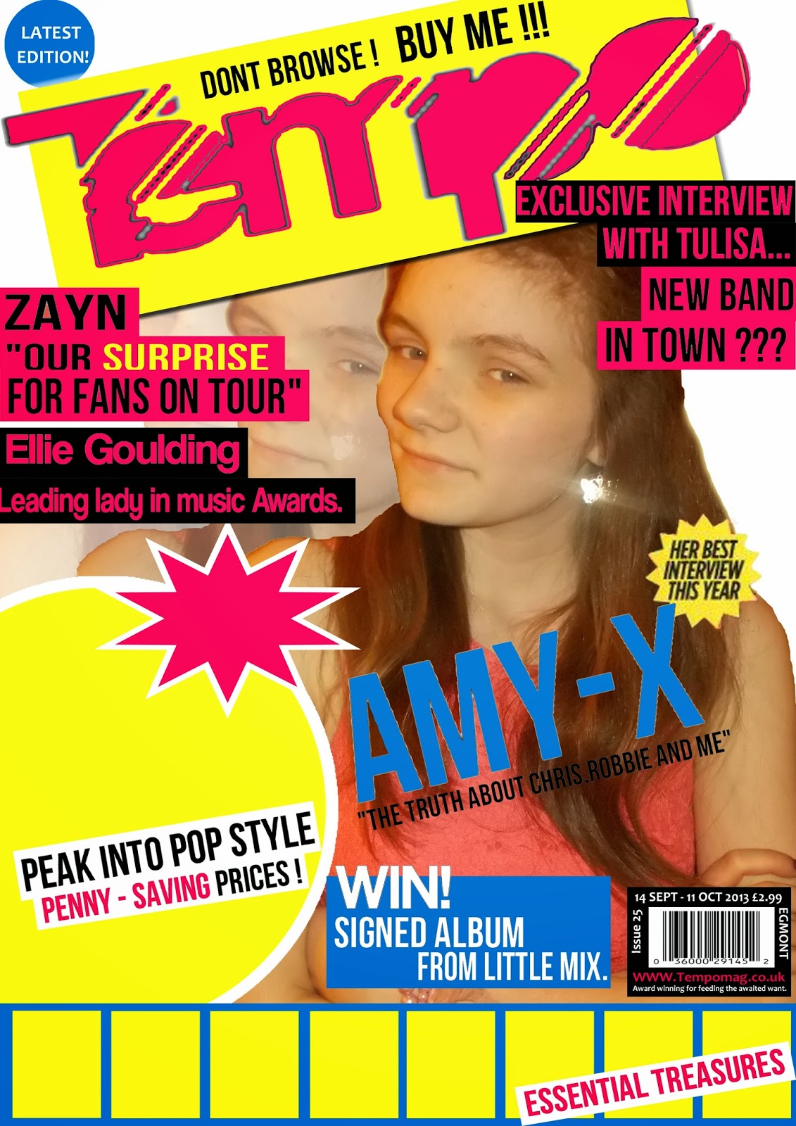
My final piece-Tempo

Here is my final Front cover! Completely finished.

Here is my contents page, completely finished.

Finally, here is my double page spread.
I uploaded all of my music magazine to ISSUU but the bottom of my work got cropped off at the end.
My double page spread is now FINISHED !

Wednesday, 2 April 2014
My first draft of the music article!
Q1) Hey Amy! How are you? Are you nervous seen as this is your FIRST ever interview?
A1) Hello Tempo.Yes, i am very well thank you but i am a little nervous, i's quite daunting having so many people interested in you all at once. Although saying that, i cant really complain too much...
Q2) Absolutely! Its something you will have to get used to in the music industry. Wouldn't you agree?
A2) Ohh, absolutely. The music industry is a tough business to get into, but i'd hazard a guess that it is even harder to stay there and keep fans interested. I'm sure only time will tell if i'm cut out for the job but fingers crossed.
Q3) Oh don't worry Amy we have No doubt that we will be seeing a lot more of you yet! One things for sure, your right about the music industry being a hard career to get into. So i'm sure i speak for everyone when i ask this; how did you do it?
A3) Well it was actually thanks to a friend of mine at the time. We had a school concert coming up and although i had sung around the house and infront of friends, i had never dreamt of being where i am today. Anyway, one of my friends was entering as her dream has always been to make it big so to her a confidence boost she asked me to sing alongside her. i wasn't sure at first but felt i owed her this favour so agreed. After the performance a man, who i now know as Michel Dunlop, asked me if i was interested in taking singing up as a career choice, i remember laughing at first but noticed his face was quite serious. And well, a long story cut short, he signed me up and here i am. I guess he saw potential...
Q4) Wow! Thats incredible! You seem to have a lot to thank your friend for. Lets come to your age for a moment, does singing as a full time career not affect your education? After all, your only 17, surely you should be at college?
A4)No! My parents are adamant that i continue with my education as anything could go wrong in the world of singing. To be fair i feel the same, i would rather be an intelligent singer that has a back-up plain, than a not so intelligent singer where anything can go wrong. I'm the type of person who likes to be in control of their life, i always have been like that. So in conclusion to your question i have a private tutor as i would not be able to juggle music around school hours, its impossible.
Q5) Oh. Well it sounds like you have everything all mapped out! What advice would you give someone trying to be successful in the music industry?
A6)I would tell them not to give up on their dreams, as thats all we truly have when you think about it, and try knew things, throw yourself into the deep end- you never know, it could change your life! I mean, take me for example; if someone had told me i would be having my first interview because of a singing talent, i would have laughed at them.
Q6)Good advice! So tell us a bit about your new album?
A6)I'm so glade you asked, i've been dyeing to talk about this all day! It's called "X x Y", and I've made around 6 tracks for the album. I particularly like X x Y as it reminds me of that feeling you get when everything falls into place, a bit like a maths question that wonderful feeling you get when you finally find that missing answer. The song was inspired to me by the event in which i got to this stage and how i've made the first step (of many i hope) to a better life. I just hope my fans will love it just as much as i do.
Q7) Thats fantastic and we cant wait to buy it! When does it go on sale?
A7) It will be ready to buy on the 15th of october and i'll also be doing an album signing on that day in HMV at oxford street so any fans reading this please do come along!
Q8) Im sure there will be quite a turn out dont you worry. So if its ok with you Tempo would like to dig a little deeper. Do you have a music icon that inspires you?
A8) Its funny you should ask, as a matter of fact yes i do. I absolutely love the girl band "Little Mix" they are amazing aren't they? Good job from the X-factor judges putting them lovely lot together, their music is terrific and i admire the passion they have for their work its defiantly reflected in their songs. I think my favourite song by them would have to be "DNA". The lyrics are beautiful and if im half as famous they are i will be over the moon.
Q9) Tempo 100% agree with you Little Mix are amazing and fantastic role models. Yes, the song DNA is very good. Speaking of love, is there a lucky lad in your life?
A9) Ha... No not right now. I've never really been head over heels for any boys, i'm more of a education and fun seeking kind of girl. Plus i'm too young, i don't have time for boys what with music and school work it just wouldn't work. I think i'll save romance till im older.
Q10) Good choice. Go girl power! Finally, where do you think you'll go from here?
A10) Well im gasping! So first port of call is Starbucks! Ha... only kidding, i wouldn't like to make obnoxious predictions but i'd like to think i will continue to feed my audiences needs and make it as big as possible.
Tuesday, 1 April 2014
Double page spread progress

Thursday, 27 March 2014
2nd Photo shoot - part 1

The "ohh" photo (as I like to call it). This photo was the first one I took in this position and I got this idea from one of the existing double page spreads of a "We love pop" magazine. The problem with this photo is my face is to far down and the legs are not positioned properly so the image looks slightly weird. Another problem with the image is my location, however the reason I did not focus on location to much was because I was planning on cutting all the images out anyway so didn't see the background to be too much of a problem. However I later found out that this was an issue as it took far to long to cut one image out.

This image is slightly better as my head is looking further up however the legs are still an issue and the camera is to far away from the models face. Although to be fair it is an improvement compared to the 1st photo taken.

Slightly better again...

Finally, here I seemed to have perfected the posture, however it is too similar to the "we love pop" image and so can not be used as the main image but may be used a small on the side of the central image.

In the next five images I have decided to use a prop and the prop I have decided to use is a basketball. This is mainly because the double page spread will consist of an interview and the interview will be of "Amy-X" and as she is knew to the industry the reader will want to know as much about her as possible therefore I decided to make her hobbie basketball so she can connect with the younger audience. This will be reflected in one of the images to the side of the interview.

To a certain degree this image is good but I don't think it will work properly the way it should on the double page spread so I may not use it but I love the way the colour of the jeans and the ball clash to make them both stand out in the image. Shows the significance of both the artist and her interest. She is the centre of attention.

This image is good as its striking, again the contrast of the colours help it a lot, however if you look closely the image is blurred and so may not work where its needed. Its a shame because the model looks innocent and gains the interest of the audience, especially with the way the light is almost golden.

This image is by far the best image taken with the basketball as her facial expressions are interesting her posture is confident but questioning and she's holding the basketball as proud as she can so it stands out. This will be used on the double page spread as one of the little snip-its.

This image is also good as her stance is bold and confident.

In the next three photos I used a chair as a prop just to see if I could get a position that was unique and hadn't been used yet however, this was one of the worst ones as too much of the chair was in the shot.

This one was better but still too much chair in the shot.

Double page spread/ adjustments to contents page

There are still many adjustments to make such as the images, colour of the page (if any), and i need to add the content of the interview, but as they say "so far, so good". Im hoping to complete my front cover and contents page by monday so all i have left to do is the double pages spread.

Today i also came to the decision (with some help from Mr Sloan) that i needed to alter my contents page as it looked too much like the existing magazine "We love pop". So baring that in mind i have rotated the box's that will contain the images in them and put the page numbers at the head of the box's so that it resembles these are key stories that must be read.
I have also added yellow circles around the page numbers to help them stand out even more and added two arrows at either end of the title to show that it has a uniqueness about it.
My front cover - the adjustments

Thursday, 20 March 2014
Contents page - nearly finished

Since the last time i added an update of my cover page i have added an editorial, the title to signify it is the contents page and the captions that will go beneath the images. The quotes from the "celebrity" is in blue so that it stands out to the audience and gives them a taste of the potential article.
I still have a bit left today and so tonight i will be doing my 3rd photo-shoot , once this is done the images will be updated to my blog and analysed as before.
Wednesday, 19 March 2014
Magazine cover- latest progress

Today in lesson and my free period i added the two images at the bottom as "posters" to get started on them and i added a few images of clothing items that i made out were worn by the stars to attract a wider market.
I also completely changed the central image and i think this one works a lot better than the previous one, mainly because the model looks a lot more bold and is more confident than the last one. overall, i think i am on track.
Thursday, 13 March 2014
The progression of my music magazine front cover.

Originally, this was my first draft of my magazine where i would have a range of photos at the bottom to act as posters for the reader. However, after talking with my media teacher we both agreed that the central image needed to be changed along with the shade of pink due to the fact its abit to grown up for the target audience it needed to be darker as to appeal to the younger audience.
Baring this in mind i have currently changed the shade of pink and the shade of blue so the work together more affectivly. I still need to change the central image which i will be working on tonight, 13th thursday 2014, and i will post the latest addition to my blog as soon as i can. Overall, i am very pleased that i am nearly finished and it is looking more like a magazine every day :)
Plan for my double page spread.

This is one idea for my double page spread, i decided i would like it to be quite packed but simply laid out at the same time. On the Right hand side i will have the interview of the artist, the questions will be in another colour so they stand out and beneath it will be the artists answer. Within the answers/ artists response will be a highlighted quote to show there may be some importance in what the artist said. Then on the Left hand side will be the main image of the artist looking bold and confident which will be made so that the reader can cut it out to use as a poster if they want to. There will also be little snaps of the same artist maybe even from the same photo shot to enhance their importance to the magazine. At the bottom of the image there will be a small caption of what the image was for and maybe where it was based, simply stating who it is and the basic information that a reader may need to know. At the beginning of the article i will also have an introduction of the artist and here i will add a "Drop capital" just so the reader has something to go on if they have not heard about them before. (Background history) The "Pull quote" will be based at the top of the Right hand page so that the reader is instantly dragged in to the story/interview, getting the hocked from the beginning. The name of the artist will also be at the top as well maybe in italics so that the article is clear on who it is about.

My second idea is simular to the first but just swapped round so that the main image of the artist will be on the Right hand side instead, it will still be able to be cut out to use as a poster if required but this time there will only be one image. I believe they call this a portrait of the artist. Then on the Left hand side will be another image of the artist in a different position or location and the article will be right next to it. The "Pull quote" will be placed at the top in order to gain the readers attention at first glance.
Overall, i think i prefer my first idea so i will begin to make it using photoshop and see how it turns out, this is mainly because this one seems to work the most effectivly whilst consisting of all the conventions of a double page spread.
Wednesday, 12 March 2014
Main features of a double page spread!
 |
| Double page spread ideas ... |
Main conventions of a double page spread are:
- Main image that outlines the whole page and signifies who and what the article is about
- usually, for a pop magazine there is a "pull quote" from the article as the title
- Normally, there will be more than one image
- The article will be about an interview of the artist and there fame or personal life
- Certain bits from the article or the question will be highlighted so the audience take notice of this in particular
- The article will be portioned off into to paragraphs of the question and the answer
- The aim of the article is to be informative and provide the latest gossip for eager fans
- The article will use "Drop capitols" at the beginning of the sentences or where it works
Thursday, 27 February 2014
Contents page - beginning

Today i have begun to make my contents page. This is how far i have come within two hours. Over the weekend or the rest of today i am going to take a load of images to finish my cover page and my contents page complete.
Wednesday, 26 February 2014
Nearly finished !!

This is my "Pop" music magazine ! I have nearly finished and received critical fed-back. Im thinking about changing the salmon pink colour to a black or darker pink. I also need to take around 10 images to pose as posters at the bottom for the reader and around 6 photos of clothing or a model in typical pop clothing to promote the magazines popularity. I am also going to take a new photo for the central image where the model is smiling so it makes it look more professional. Providing i make these changes i think my magazine will look the best i can make it, then i can move onto my contents page!!! I hope to be finished with the cover by Monday 3rd Latest.
Friday, 14 February 2014
Perfecting the Barcode,flash and shaping the magazine.

Today in my free period i decided to work on perfecting the Barcode which i got inspiration from the magazine "We Love Pop". Personally i think i have made it the best it can be as it consists of the barcode,price,issue of magazine and a website address.

Today i also worked on a little flash at the top of the page to enhance the fact the magazine is the latest one of the series. Personally i think it looks quite a professional and adds attention for the reader.

Finally here is the beginning of my final piece. The magazine is beginning to shape really well and i feel im finally on track. Thanks to the opinion of my media teacher im still considering changing the central image but for now i will continue to build around it.
Thursday, 13 February 2014
Update on music magazine.

My magazine is beginning to take shape. Most of my ideas have been influenced by already existing magazines which gives me more confidence on how to make my magazine work.
Thursday, 6 February 2014
What i have done today?
Today i have uploaded my images and saved them to my USB stick to use them for my front cover,contents and double page spread. I have started my new front cover and will try to complete two designs so that i have a choice however the deadline is next week so i may not have time. I have also posted my update of the cover on my blog to show what i have achieved today.
Beginning of new music magazine

After much debate i have decided to use an image of myself and here is the beginning of my music magazine design. The new photos i took will be posted during the week. I have chosen a purple/pink title so that it stands out above the pink dress theme. This is my interpretation of pop.
Friday, 31 January 2014
Fed back
After a conversation with my media teacher i am feeling better and more confident about what i have to do to my work to achieve. I realise now that i need to change the genre to pop as i have a better understanding of this genre. So again tomorrow i will be setting out to take a fresh load of images to complete my cover page before the holidays.
I have also begun to make my contents page which will be posted during next week. However, i have found some difficulty with the layout and font. This is because i have used the same font the whole way through it just looks different due to the size i have had to use when stretching it out. This is something i will need to think about before i finish. In my personal opinion i also believe that the contents page is easier to complete than the cover page as i have more ideas for the contents page which will also be posted at some point next week.
I have also begun to make my contents page which will be posted during next week. However, i have found some difficulty with the layout and font. This is because i have used the same font the whole way through it just looks different due to the size i have had to use when stretching it out. This is something i will need to think about before i finish. In my personal opinion i also believe that the contents page is easier to complete than the cover page as i have more ideas for the contents page which will also be posted at some point next week.
Thursday, 16 January 2014
Music magazine practice

Wednesday, 15 January 2014
Media mock exam
I had my media mock exam today and i can safely say i prefer the coursework. However on the bright side it made me more determined to get my media A-level!!!!!!! so Now i am making plans for my next photo shoot consisting of; coloured photos, more props, better weather and NO school uniform ;)
Monday, 13 January 2014
Update
Although i like the images i took on friday the 10th of janurary, i am going to do another photo shoot to gain more photos and have a wide range of choice. i might also do some in colour so i can have an even wider range of choice.
Friday, 10 January 2014
Photo shoot

With this photo I was trying to create a wonderous look. This is mainly because in RnB songs its full of depth and meaning whilst the lyrics speak for itself. In a magazine there are no words to be spoken so the images have to do the talking for itself. I believe in some ways I have achieved this as it appears there is a lot of story behind the image its down to the audience to judge what that might be.

With this image I was trying to create a typical RnB style with the headphones and constantly improving technology. This image shows a world were people and style are constantly changing people just have to be willing to except it.

With this image I feel it speaks for itself. This is a potential front cover photo as he is not your typical RnB character but he doesn't have something unique about him and as the magazine has to be different but have some characteristics I feel he has a uniqueness about him.

This image is amazing. it has so much depth to it and will go in my double page spread that will contain a montage of images.

This image was quite literally taken without either one knowing to see if I could get something special. Although its in the moment its still not as good as some of the others but will definatly be used in the montage.

I feel this image has a lot of character. Now although I did not take it I did direct the photographer throughout the whole shot. I wanted something that clicked with the RnB stereotype whilst making it feel modern at the same time. I have chosen black and white as I feel that RnB is quite straight forward there's not much in-between to a certain respect. the picture will add enough colour of its own to the audience it doesn't have to stand out to be recognised. In fact the black and white will make it stand out as it is something different.

RnB is mainly aimed at teenagers now days so this photo reflects how much people can respect the things around them and enjoy it. RnB has to relate to its audience and this image does.

Same again.

This image is so amazing. Im thinking about using for my double page spread as it is so natural and beautiful in its own right. it has so much meaning behind it and can really make an audience think.

This will go in the montage so people can see who helped with my work. But I also have other plans for this image which may consist of a small showing on the front cover. (still debating this)

Here I was trying to achieve a close up of two faces as some examples I have seen have used a similar technique.

And finally, here is the end of the road.
Subscribe to:
Comments (Atom)